Importance of Mobile-friendly Design and Its Impact on User Engagement
Topic: Web Design | 3 min read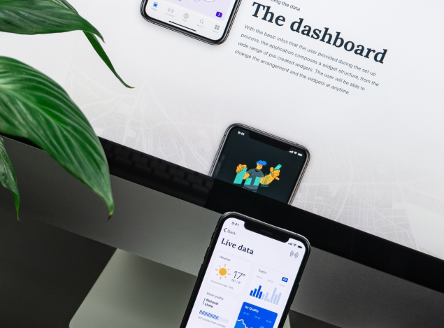
In today's digital age, smartphones reign supreme. A staggering over 60% of global website traffic now comes from mobile devices. With the internet at their fingertips, users expect seamless experiences across all devices. This article explores why mobile-friendly design is crucial and how it directly impacts user engagement.
The Mobile Revolution
Gone are the days when desktop computers were the primary means of accessing the internet. With the widespread adoption of smartphones, people now have the power of the internet in the palm of their hands. Whether it's checking emails, shopping online, or scrolling through social media feeds, users are increasingly turning to their mobile devices for convenience and accessibility.
The Rise of Mobile Shopping: As an example, mobile commerce has exploded in recent years. In 2023, over $735 billion in retail sales were conducted through smartphones worldwide. If your website isn't mobile-friendly, you're potentially missing out on a huge chunk of potential customers.
Responsive Design for All Screens
One of the key principles of mobile-friendly design is responsiveness. A responsive website or app is designed to adapt and adjust its layout based on the screen size and device being used. This ensures that content remains easily accessible and readable, regardless of whether it's viewed on a smartphone, tablet, or desktop computer. By embracing responsive design, businesses can reach a wider audience and provide a consistent user experience across all devices.
Enhanced User Experience Mobile-friendly design isn't just about making a website or app look good on a smaller screen—it's also about providing a seamless and intuitive user experience. Mobile users have different needs and behaviors compared to desktop users, and their expectations reflect that. They want fast-loading pages, easy navigation with large tappable buttons, and minimal typing. By optimizing for mobile, businesses can meet these expectations, reduce bounce rates (users leaving quickly), and keep users engaged for longer periods of time.
Impact on User Engagement
User engagement is a key metric for measuring the success of any digital platform. It encompasses actions such as time spent on site, pages viewed per session, and interactions with content. Mobile-friendly design directly impacts user engagement by removing barriers to accessibility and providing a more enjoyable browsing experience. When users can easily find what they're looking for and navigate a site without frustration, they're more likely to stay longer and engage more deeply with the content.
SEO Benefits
In addition to improving user engagement, mobile-friendly design also has important implications for search engine optimization (SEO). In 2015, Google introduced mobile-friendliness as a ranking factor in its search algorithm. This means that websites optimized for mobile are more likely to rank higher in mobile search results, leading to increased visibility and organic traffic. By investing in mobile-friendly design, businesses can improve their SEO performance and attract more visitors to their site.
Conclusion
In summary, the importance of mobile-friendly design cannot be ignored in today's mobile-first world.
Key Takeaways:
-
Over 60% of website traffic comes from mobile devices. Prioritize mobile optimization to stay competitive.
-
Responsive design ensures a seamless user experience across all devices, leading to higher engagement and lower bounce rates.
-
Responsive design ensures a seamless user experience across all devices, leading to higher engagement and lower bounce rates.
By embracing mobile-friendly design, businesses can create a winning online presence that attracts, engages, and converts users on the go.